Overview
EcoCart is still one of my favorite hackathon projects because it had a very clear product thesis from the beginning. We were not trying to build a generic “green shopping” app. We were trying to make the environmental cost of an online purchase visible at the exact moment someone was about to make that decision.
That framing mattered. A lot of sustainability products become dashboards that people only visit after the fact, when the moment to change behavior is already gone. Our thought process was to move closer to the buying flow itself, then support that with a second surface that could give users deeper context, progress tracking, and better recommendations over time.
That idea became EcoCart, an AI-powered sustainable shopping companion made up of two connected parts:
- a browser extension that could sit inside real e-commerce flows
- a dashboard web app that could summarize impact, surface patterns, and make the data feel actionable
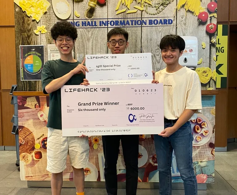
The project went on to win LifeHack 2023 and the SGID Award, and it still stands out to me as one of the clearest examples of product framing, frontend execution, and demo storytelling all lining up under hackathon pressure.
Problem Framing
The starting insight
The problem we kept coming back to was simple: online shopping is incredibly convenient, but the environmental tradeoffs behind a purchase are often invisible. Even if someone wants to make a better choice, they usually have to leave the shopping flow, do their own research, compare alternatives manually, and interpret a lot of scattered information.
That felt like the wrong interaction model.
Instead of asking users to do extra work, we wanted the product to do more of the work for them:
- detect what they were already shopping for
- estimate or surface the environmental impact in a digestible way
- recommend greener alternatives while there was still time to switch
- reward better choices so the experience felt encouraging instead of guilt-driven
That sequence became the backbone of the project. We were not only building a sustainability tool. We were designing a behavior loop.
The product decisions
Very early on, we tried to keep ourselves honest by asking one question: what would make this feel useful in the middle of a real purchase, not just impressive in a pitch?
That led us to a few product decisions:
- Meet the user where they already are. The extension mattered because it let the product appear in-context rather than forcing people into a separate app first.
- Keep the signal legible. A sustainability score alone can feel abstract, so we wanted the dashboard to translate raw product and shopping data into something a user could actually understand.
- Make alternatives actionable. If we surfaced a problem, we also needed to show a next step. Otherwise the product would stop at awareness instead of helping with decision-making.
- Build a demo loop judges could follow immediately. Hackathons reward technical ambition, but they also reward clarity. We needed a story that could be understood in one pass.
That thinking shaped the architecture more than the technology did. The stack was important, but the stronger decision was how each piece of the product contributed to a single user journey.
Build Execution
How we split the work
The public project materials described our roles clearly, and that division helped us move fast. Kei Lok focused on frontend engineering and UI/UX design, Yu Hoe handled the AI and backend side, and I worked on the frontend and the web extension.
That gave us a practical way to parallelize the build:
- the extension could focus on living inside the shopping journey
- the dashboard could focus on visibility, interpretation, and polish
- the backend and AI layer could focus on data, recommendation logic, and system glue
For me, the interesting challenge was the extension side. If the extension felt clunky, delayed, or disconnected from what the user was actually doing, the entire product loop would weaken. So a lot of my thinking was around immediacy: how do we make the product feel like it belongs in the shopping flow rather than feeling bolted on?
What we built
The final system covered more surface area than most hackathon projects. Based on the public repo, the stack included Next.js, Chrome Extension Manifest V3, Supabase, AWS, Docker, Netlify, Tailwind CSS, OpenAI API, and SGID.
That combination made sense for the problem:
- Next.js gave us a fast way to build a polished dashboard experience
- the Chrome extension let us place the product inside real e-commerce flows
- Supabase gave us a lightweight backend foundation without a lot of setup drag
- OpenAI helped turn product and shopping data into more usable interpretation and recommendations
- SGID gave the project a stronger identity and trust layer, which made the concept feel more credible as something beyond a throwaway demo
From a user point of view, EcoCart was meant to feel like a companion rather than a report. The extension tracked or interpreted shopping activity close to the source, while the web app created a broader picture through footprint tracking, progress visibility, and alternative suggestions.
How we worked under hackathon pressure
The main constraint was not a lack of ideas. It was time. Once we had the core thesis, the real job was cutting scope without cutting the story.
The way we approached it was roughly:
- define the smallest believable end-to-end user journey
- identify which part of that journey had to feel real in the demo
- split ownership so design, frontend, extension, and backend work could move in parallel
- keep checking whether each feature strengthened the main loop or distracted from it
That last part was important. In hackathons, it is easy to keep adding clever ideas because the problem space is rich. But the better move is usually to protect the core loop. For us, that meant keeping the product centered on awareness, alternatives, and action rather than trying to become a full sustainability platform in a weekend.
Outcome
Why the project worked
Looking back, I think EcoCart landed because it was stronger as a product story than as a technology showcase alone.
It connected a few things cleanly:
- a real and understandable user problem
- a product surface that showed up in the right place
- enough technical depth to feel substantial
- a demo that made the value obvious very quickly
That is also why the extension mattered so much. It turned the project from “yet another dashboard” into something that could influence a live decision. The dashboard then gave the idea more weight by showing that this was not only a momentary prompt, but part of a larger, trackable system.
One of the moments from LifeHack 2023 after presenting EcoCart.
What I learned from it
EcoCart reinforced a lesson I still come back to: strong technical work becomes much more memorable when it is tied to a clear decision point in the user’s workflow.
We did not win because we used a long list of technologies. We won because the technologies supported a product idea that was easy to grasp and a user flow that felt believable. The engineering, design, and demo all pointed in the same direction.
That project also reminded me how much I enjoy building at the boundary between frontend experience and product behavior. My contribution sat on the frontend and extension side, but the deeper work was really about product timing: showing the right information when it could still change what the user did next.